Thursday 29 September 2011

By Allison Watkins, gorgeous project of embroidering onto one...

By Allison Watkins, gorgeous project of embroidering onto one...:


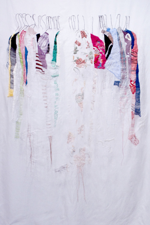
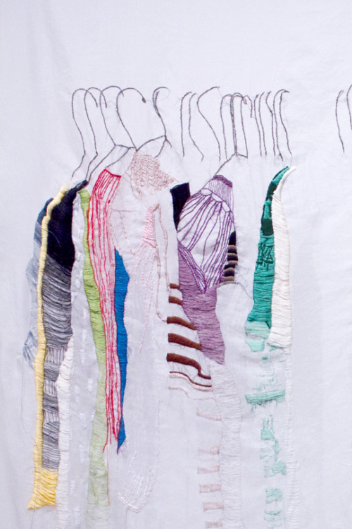
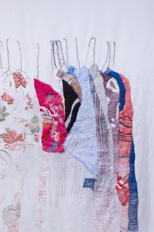
By Allison Watkins, gorgeous project of embroidering onto one sheet of fabric an outside view of your wardrobe full of clothes, some great patterns in hers. I think mine would have considerably more plaid in than this one!

Prep

Prep:
I am having fun preparing for The People's Print 'Born to be Wild' workshop at the V&A based on the current Post Modernism exhibition. The workshop will study various Post Modernism design styles that will be re-created by handmade methods and manipulated digitally to create the first co-design swatch book shared by all the participants, ready to print, make and wear.
Being a design student in the 80's, I am in my element! re-connecting with design, art and music styles from 1970 -1970 that now have a significant place in history and that was a part of my design education.
With my main passion for pattern and textiles, I have been looking at French born Nathalie Du Pasquier, a founder member of the Memphis group until 1986 where she was the designer of fabrics, textiles, carpets, furniture and objects. After the Memphis group broke up in 1987 Nathalie carried on to become a successful painter. Her work still has a love of colour, compostion and everyday objects that surround her.
Nathalie Du Pasquier.
Follow The People's Print workshop here


By Sarah Hennessey, I think that it is wonderful how she has...

By Sarah Hennessey, I think that it is wonderful how she has...:


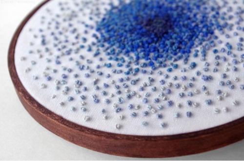
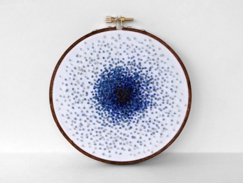
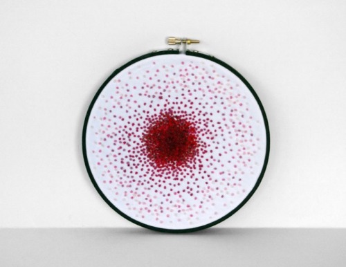
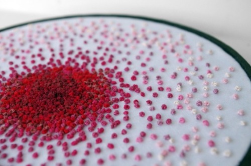
By Sarah Hennessey, I think that it is wonderful how she has managed to use one stitch across both of these pieces of work and then used colour to give the character, making them both different. The red piece has a heart-like quality that would make the focal point on a wall, it’s great.

Inge Jacobsen: High Fashion, High Labour

Inge Jacobsen: High Fashion, High Labour:
Inge Jacobsen takes the from covers of Vogue and hand embroiders over the image completely covering the glossy cover with the texture of cross stitch. This process alters the meaning of the image from a glossy massed produced high fashion magazine cover to something that has been laboured over (50 hours of labour to be exact).
Jacobsen states in her artist statement that she wants the viewer to recognise the obsessiveness and the amount of work that goes in to embroidering the magazine covers, anyone who knows the process of hand embroidery will be able to appreciate this. The surface of the mass produced high fashion magazine has been subverted and becomes a one off object, a work of endurance, a work of art. As Jacobsen discusses in her statement the embroidered magazines can only become part of the mass produced media through being blogged and reblogged on sites like mine, but the original embroidery is different to the scanned images that flood the web.


Jacobsen magazine covers are not only changing the glossy surface of high fashion but the work also questions the way fashion is accused of objectifying imagery of women, by turning the image into an actual object. Embroidery is considered a feminine craft or ‘hobby’ Jacobsen compares the modern day pastime of browsing through a magazine to the more traditional pastime of embroidery.

See more at www.ingejacobsen.comwww.ingejacobsen.com

By Lucky Jackson, colourful and vibrant embroidery that has a...

By Lucky Jackson, colourful and vibrant embroidery that has a...:


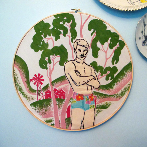
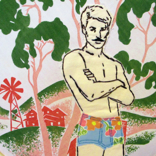
By Lucky Jackson, colourful and vibrant embroidery that has a summery happy feeling. The moustache and floral speedos are making me think of this as a very 70’s man, I love the patterns.

Thank You, Bright Bazaar!

Thank You, Bright Bazaar!:
I have to thank someone for being really, really wonderful and welcoming and just plain amazing to me over the course of this year – particularly this year because last year I didn’t really know much about him. That person is fellow blogger and London-based stylist Will from Bright Bazaar. He’s a really good person (to the core!) and super supportive of me and so many others — which makes our online community such a great space when you have friends who truly care online. How many of you just love Will? I’m sure lots of you do, and if you don’t know him well it’s time you did!
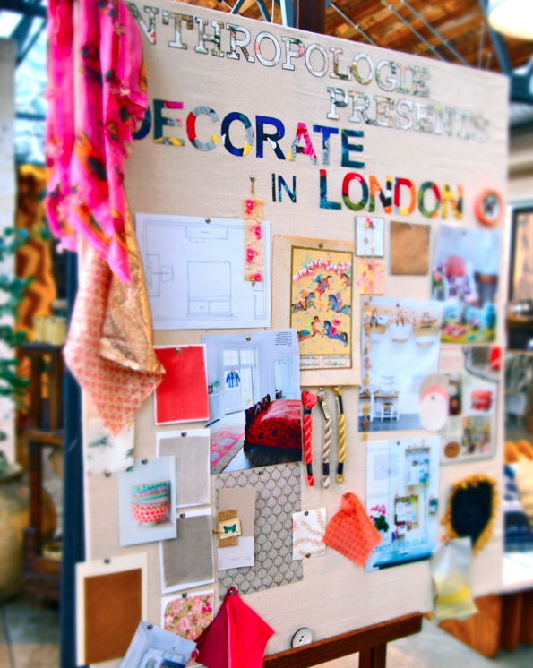
My mood board

I’ve seen Mr. Bright Bazaar at lots of events I’ve hosted in London and each time he pops up, I feel so giddy happy to see him – he brings a rockin’ positive spirit into the room and well, this little post is really just to shout him out, give him a huge cyber hug to thank him SO MUCH for being a great person all around… AND to say that he took the best photos of my event in London the other day at Anthropologie on Kings Road so thanks for that Will. In fact, this mood board photo is from him and I just love it. Leslie and I pinned it (it’s a mood board for a guest bedroom with a global eclectic vibe) and he shot it when we were finished. Thank you Will!

Will, you’re the best – keep shining bright!

(image: will/bright bazaar)


Please note: daily news and quicklinks are excluded from the RSS feed. Get the scoop on the latest finds directly on decor8! (in the upper right corner of the site).
Content © decor8. For personal, non-commercial use only. Feed ID: cdaa5590db8fca9e92d06113ccfa4e5e


Related posts:
  1. Bright.Bazaar
  2. Blue Bell Bazaar
  3. The Creative Bazaar – Get Involved!
LFW Diary SS12: Noel Stewart

LFW Diary SS12: Noel Stewart:

LFW Diary SS12: J Smith Esq.

LFW Diary SS12: J Smith Esq.:

Chemise Blanche

Chemise Blanche:
What London Fashion Week proffered up two weeks ago wasn't just the normal strengths of print and colour play but truly a broad range of designers that went with their own flow and had conviction in that. Sure, the printists and texturists had a field day playing with surfaces but a breakout designer that shone amongst the pattern fest did it with a simple white shirt.

Well, actually seventeen mens and seventeen womens shirts to be exact. Palmer Harding may be a fresh name but Levi Palmer and Matthew Harding's combined experience in freelance work as well as their respective degrees in Central Saint Martins menswear BA and MA courses have created a steady footing for them to start their highly focused label. When I went to visit them out in the super outer regions of London (zone 6 anyone???), I found the level of focus to be scarily high for such young dudes. I had to applaud their pragmatism and sensible ways - they run their studio from Harding's family home (hence the non-E postcode), they've researched production options extensively so that they can take on orders (and I predict many will be buying into their core collection) and they have singularly honed in on what most consider to be a basic. Playing it safe or steady shouldered thinking? I'm going with the latter when you think of so many London young guns that have disappeared off the face of the earth leaving transient catwalk images from shows that probably burnt their budgets out.

Ultimately, what Palmer Harding are offering for S/S 12 is a desirable line of shirts, which have a stunning subtle point of difference that separates their shirts from the others. You could apply Magritte's words here and say "Ceci n'est pas une chemise blanche". Or you could go down the M&S route and go 'This isn't just ANY white shirt. This is a Palmer Harding white shirt." Inspired by photographer Ingar Krauss and 1930s couture detailing, Harding and Palmer employ various twists and turns to inject into the shirts creating wafts of volume, draping, pleating and metal fixtures that create the right shape as well as subtly referencing to Harding's MA collection. This is all a far cry from the bulbous shapes that I road tested when I bought a piece from Harding's challenging collaboration with Topshop but I love that there are still lingering references from that collection. Whilst mostly white, grey and a very very light shade of green are also used to prevent complete white-out. No detail is superfluous or just there for decoration.

For me, there's a quiet strength in Palmer Harding's work that got me really excited when I saw it in person. I can't quite put my finger on it but their approach seemed really refreshing and you feel somewhat assured that their debut will be a success. Hope my enthusiasm hasn't jinxed anything. Paris will be the real indicator as Palmer Harding take their collection to market this week.

Palmer1

IMG_5886

Palmer2

IMG_5890
IMG_5892
IMG_5893
IMG_5899


IMG_5900


Palmer10
IMG_5907

Palmer12

Palmer Harding are already on the digital fast track with a film by the brilliant Malcolm Pate and styled by Love Magazine's Anders Sølvsten Thomsen...

PRADA SHOWROOM: AS CLOSE TO HEAVEN AS IT GETS...

PRADA SHOWROOM: AS CLOSE TO HEAVEN AS IT GETS...: Big shout out 'grazie' to Alessio Vannetti for his generosity.


LFW Diary SS12: Charlie Le Mindu

LFW Diary SS12: Charlie Le Mindu: